As the eCommerce space becomes more competitive, businesses now have to up their game when it comes to the User Experience (UX). Shoppers are bombarded nonstop with an influx of promotions, so brand’s need to find a way to quickly convey their messages. The right promotional design is so important in order for shoppers to efficiently grasp the concept and complete their purchase. Inconsistent color choices across channels, cluttered banners, and complex designs can discourage shoppers and lead to accelerated cart abandonment rates.
So how can you create eCommerce promotions that actually convert? Let’s dive into the best practices for design and copy. Here are 12 strategies to adopt plus three bonus tips.
Design Best Practices
The following list of design and copy best practices will help you improve your promotion conversions and allow you to achieve sustainable success when implemented correctly. Let’s get started.
1. Utilize Color Psychology
It’s not surprising that 85% of shoppers admit to being influenced by color while browsing through sales and discount banners or pop-ups. Color psychology is an important factor to consider when running promotions today.
What’s color psychology all about? Every color is linked to a distinct emotion, thus influencing shopper purchasing decisions. That’s why you need to pick wisely. For example, red comes across as attention-grabbing and energetic, evoking a visceral and passionate shopper response. White can be a good choice for clothing sale promotions since it’s seen as clean and noble. Pink works well for beauty and cosmetics, as it’s associated with femininity and care.
Besides finding the right color match for your product, you also need to think about the demographic you’re targeting. Gender, geolocation, and age groups are all key factors when it comes to creating an effective color palette. Remember to also match your promotion colors with your brand colors.
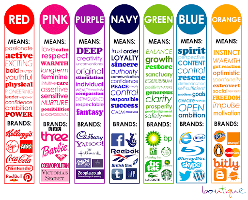
Image Credit: We Are Boutique
2. Use Contrasting Colors
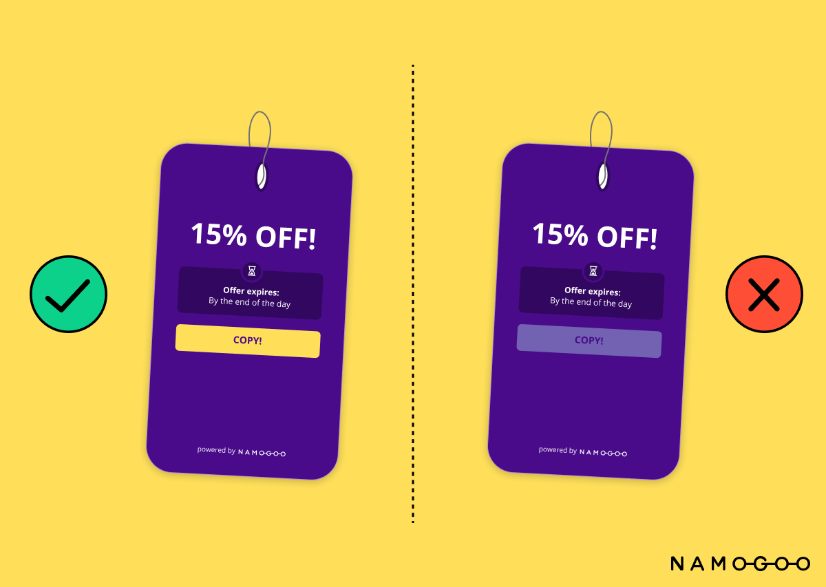
Besides working with your color palette, you should also be experimenting with contrasting colors, especially on smaller smartphone screens. This is crucial when it comes to Call to Action (CTA) buttons so that they’re visible to shoppers. When it comes to backgrounds, implement ones that create a high contrast with your content for best results.
3. Adopt Minimalism
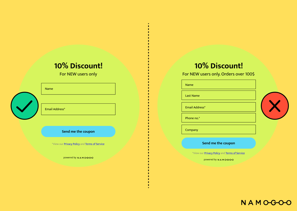
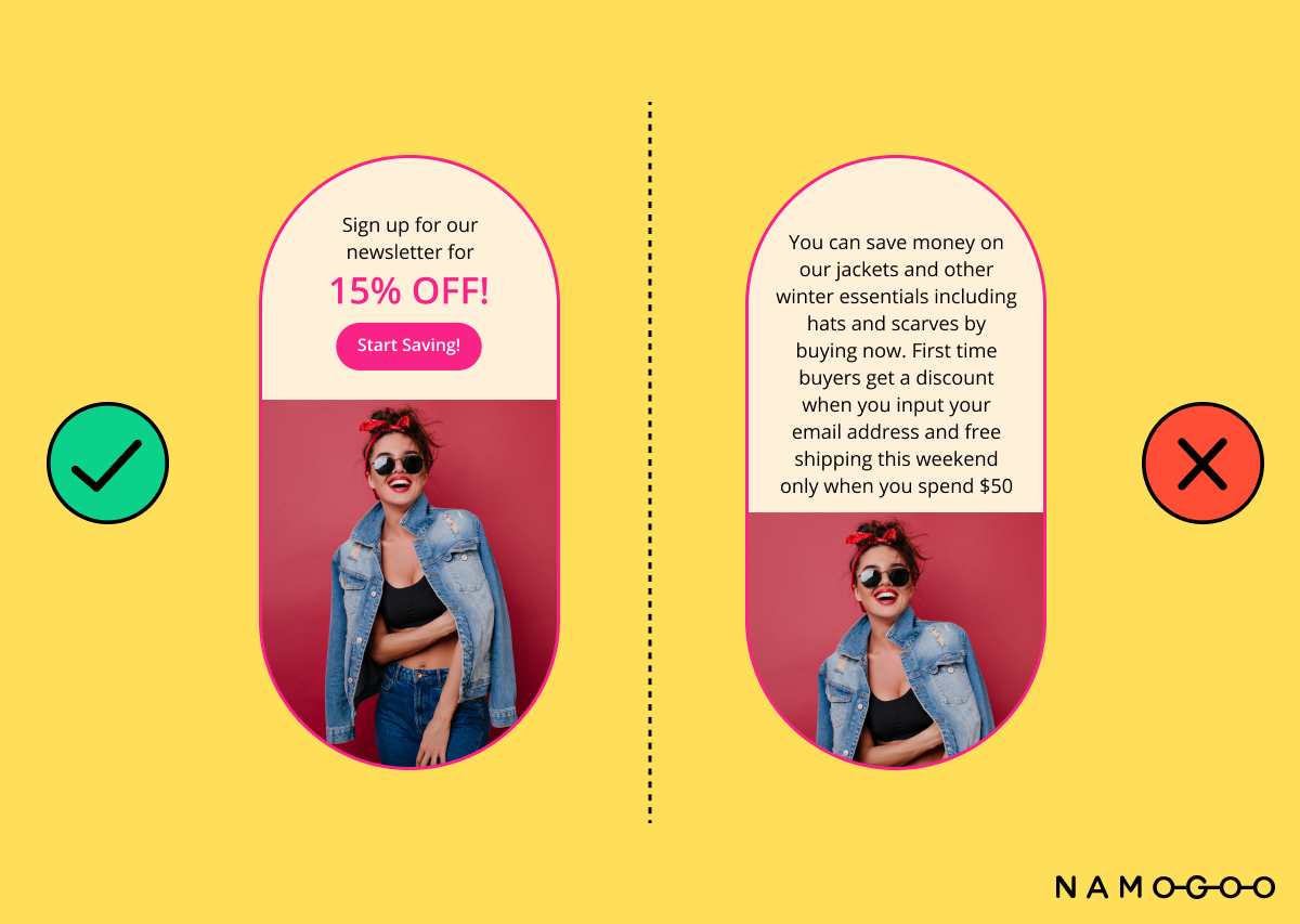
The KISS (Keep it Simple, Silly) principle is a popular design best practice when it comes to eCommerce promotions. Simple is better, as it helps keep the focus on what matters most, without confusing or overwhelming the shopper. Adding elaborate design elements, clutter, and distracting backgrounds can make the promotion harder to consume and drive away potential customers. Keep your design simple and clean for maximum impact. Less is more.
4. Be Mindful of Composition
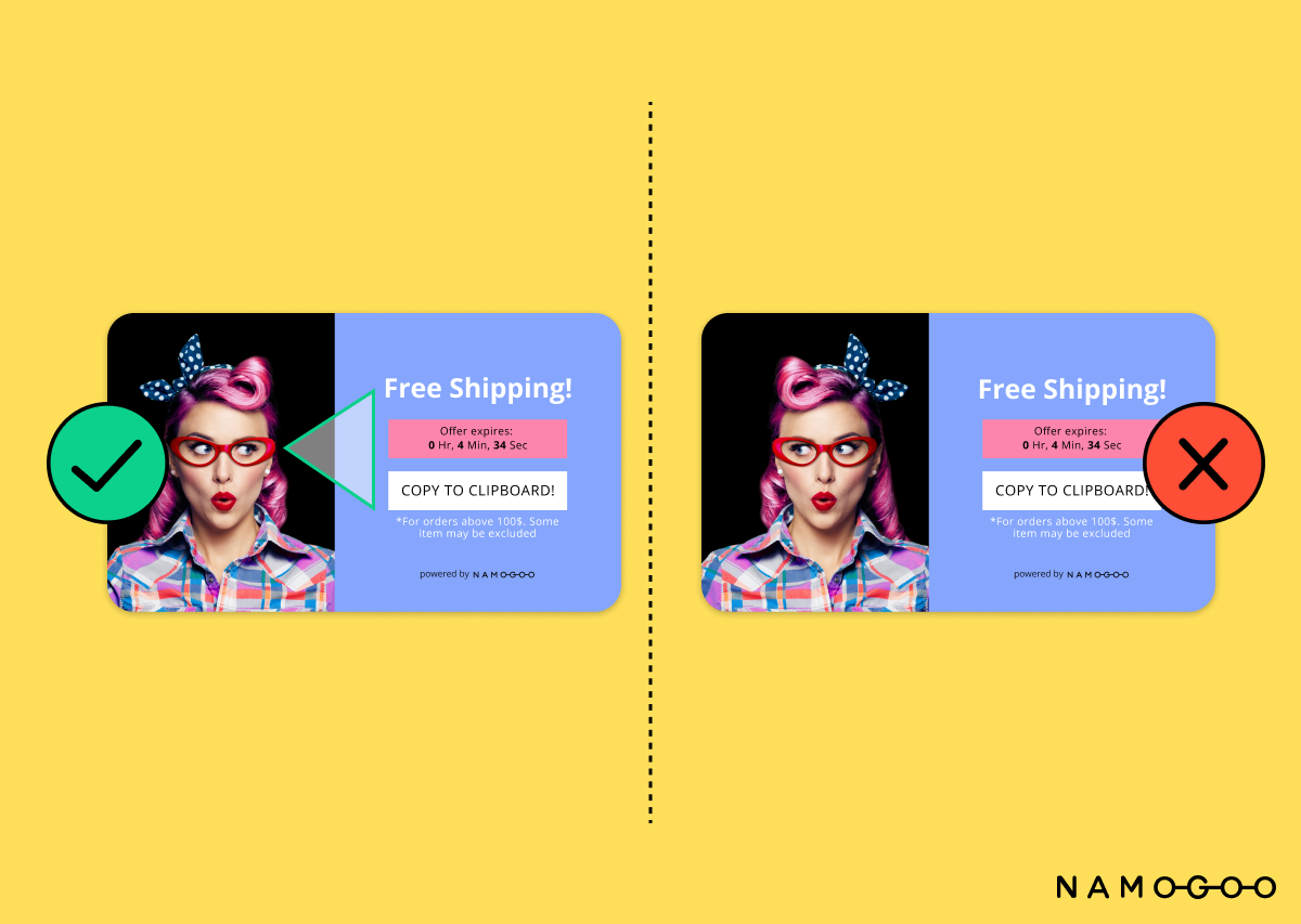
For promotional design, the triangle rule is a helpful tool. The image, CTA, and copy needs to create a cohesive image in the shape of a triangle. In the positive example below, notice how the model is looking towards the copy rather than away from it. The eye-line logic creates a cohesive, balanced image. Just make sure you’re using it just as a compositional aid that isn’t too obvious.
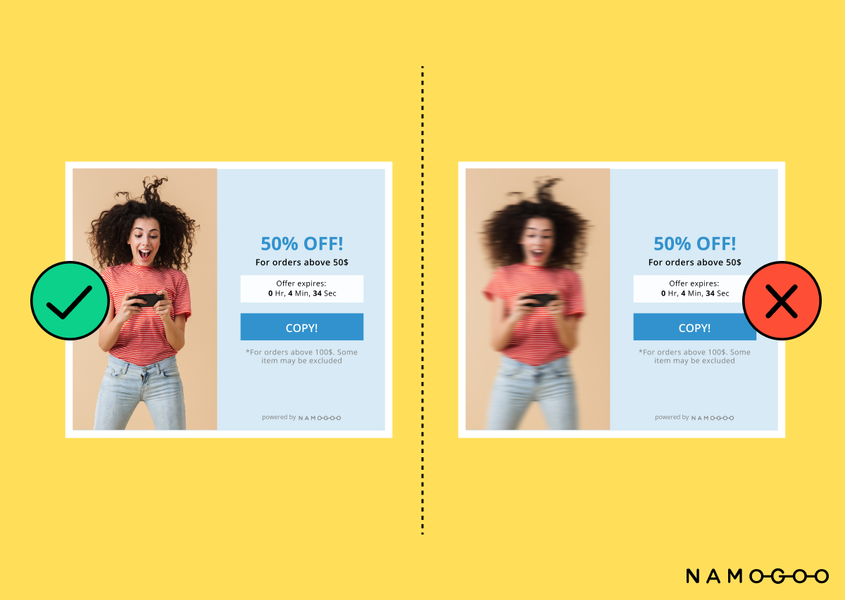
5. Avoid Using Blurry Images
Using high quality images makes your promotions look more professional. When choosing visuals such as photographs, illustrations, and graphics opt for ones with high resolution and clarity. Shutterstock is a good resource for finding images. Blurry images look messy and unprofessional, ultimately hurting your bottom line.
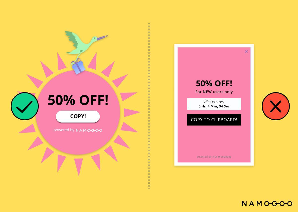
6. Experiment with Shapes
Try thinking outside the box when it comes to the design shape of your promotions. Promotion popups and banners with creative shapes can help you stand out from the crowd and can be more eye-catching than rectangles, squares, or circles. Making your promotions look more interesting and visually complex will help grab shoppers’ attention.
7. Use Micro-Animations
Micro-animations add a dynamic feel to your promotions. Why settle for static design when you can create a sense of motion that entices shoppers and gets them to notice? For example, you can create a sense of urgency with an animated offer expiry timer. Not only is this design element eye-catching and attractive, but it also creates FOMO (Fear of Missing Out).
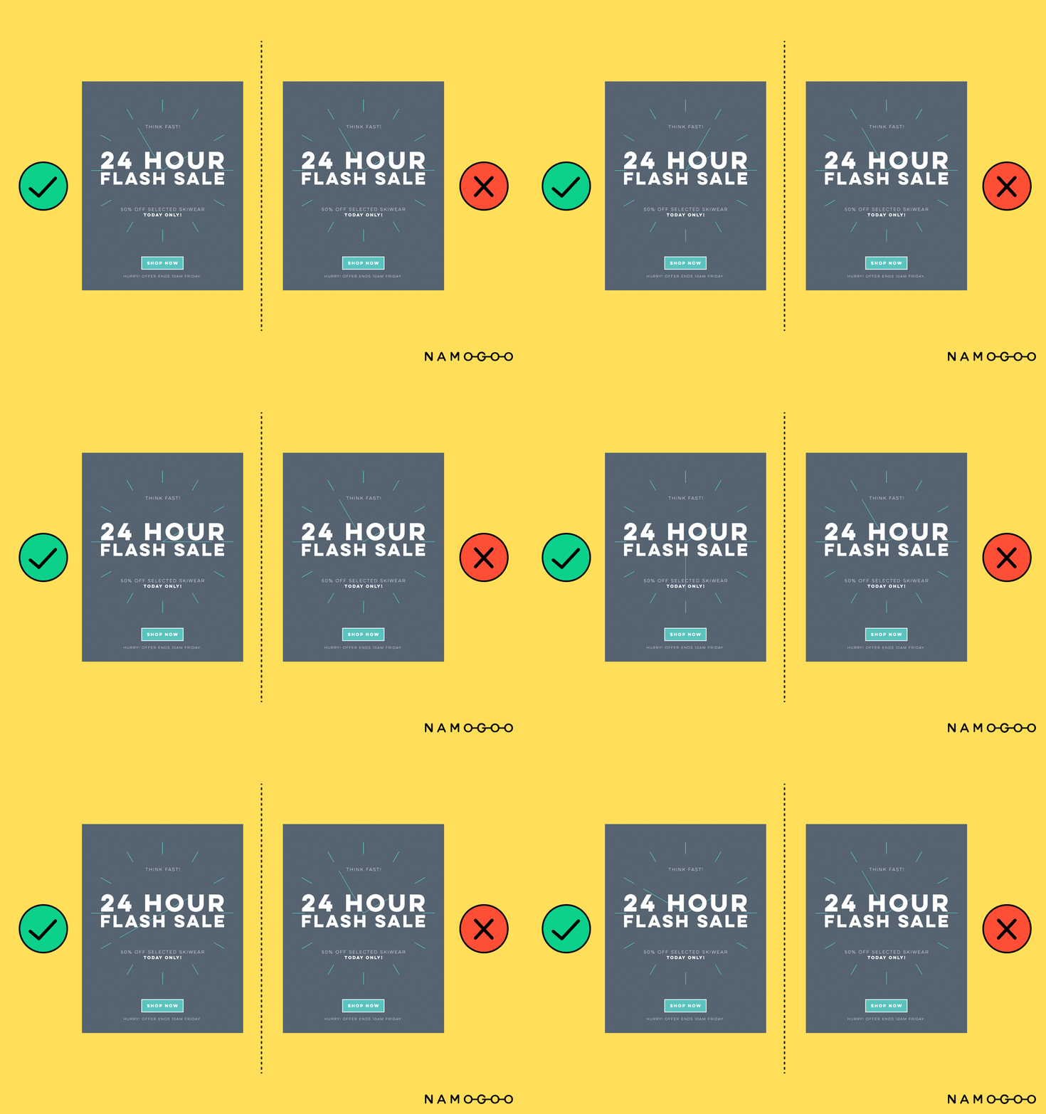
Image Credit: Chamaileon.io
Copy Best Practices
Not only is design is important for creating visually pleasing promotions, but the copy also needs to be intentional. Let’s take a look at some copy best practices to make sure you’re getting the right message across.
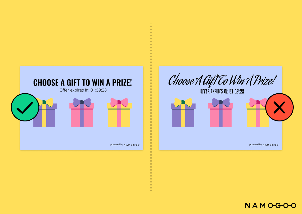
8. Font Choice
There are hundreds of fonts to choose from today. It’s important to take time to consider which font type will best fit your product, brand, and target audience. When making your choice, simpler fonts are better for readability rather than intricate, ornate ones. For promotions, choose a font that complements your brand’s font.
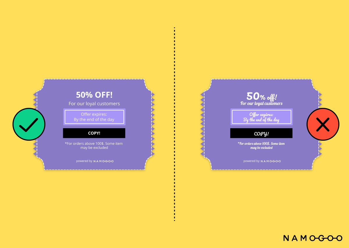
9. Pair Your Fonts Correctly
Choosing a readable font for your promotion is the first step. Next, you want to pair fonts that complement each other. Fontjoy is a tool to help generate aesthetically pleasing font pairings. Pairing more than two or three fonts in total makes your promotions look cluttered, so opt for fewer variations.
10. Go Bold
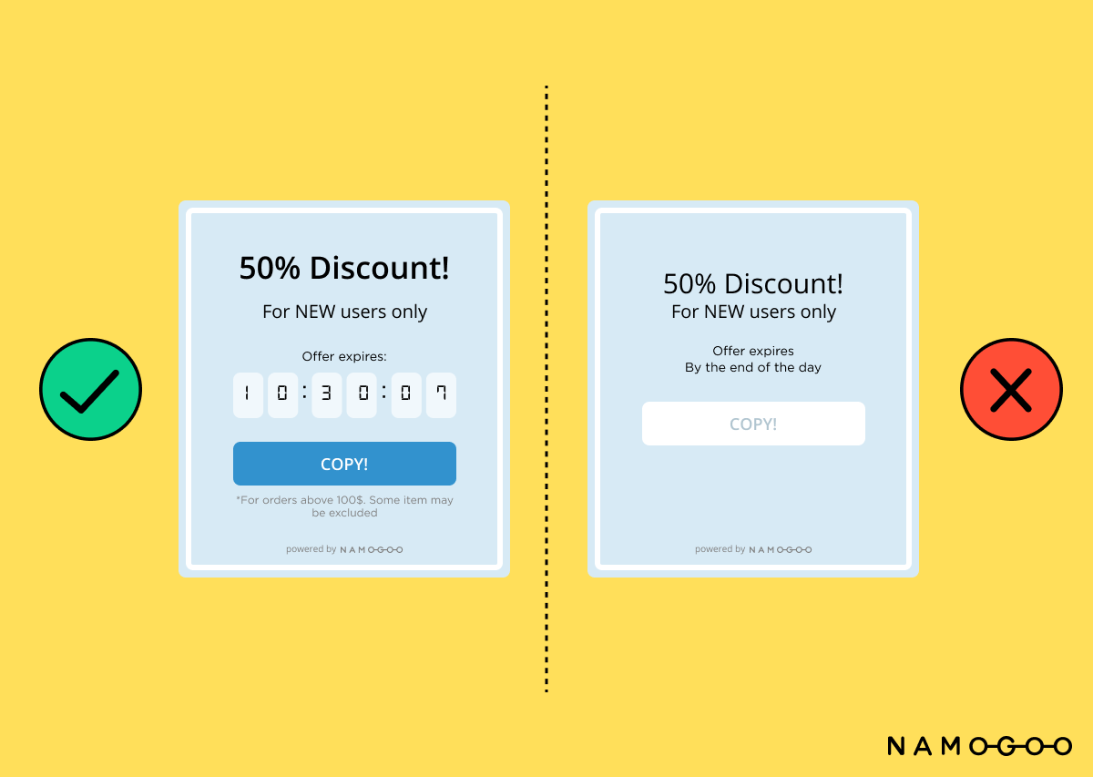
You want your shopper to be able to comprehend your promotion as fast as possible, so limit the use of light variations. Use bold! Also, make sure that there’s enough spacing between the lines. Line height should ideally be more than 1.5 times the font size. Emphasize discount numbers and expiry dates so that the shopper is incentivized to purchase.
11. Create the Right Hierarchy
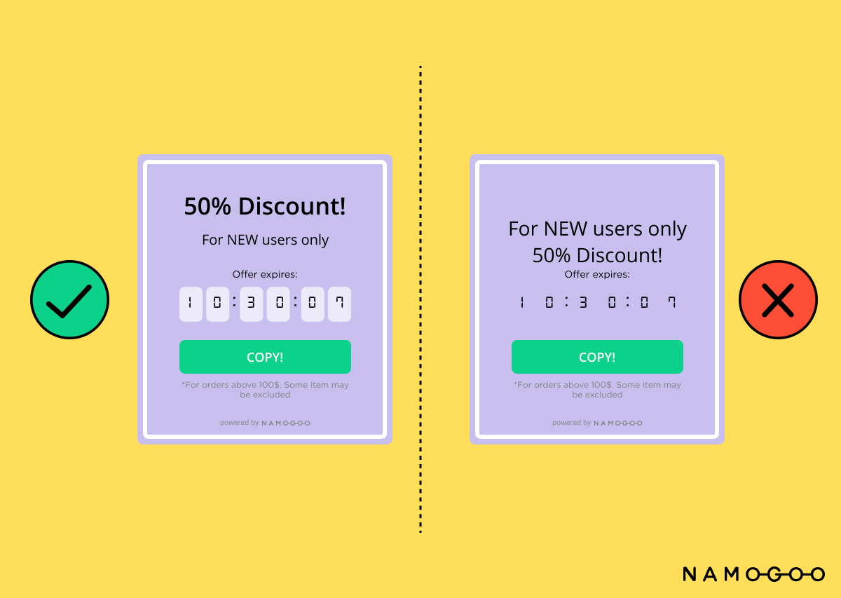
Promotion banners, pop-ups, and landing pages are significantly smaller than regular web pages. Make sure you’re using this “real estate” effectively. The main headline and the CTA should be prioritized through font size and layout in the promotion. Shoppers have short attention spans, so having a large “50% Discount” at the top (as shown below) helps convey the promotion quickly.
12. Write Concise Copy
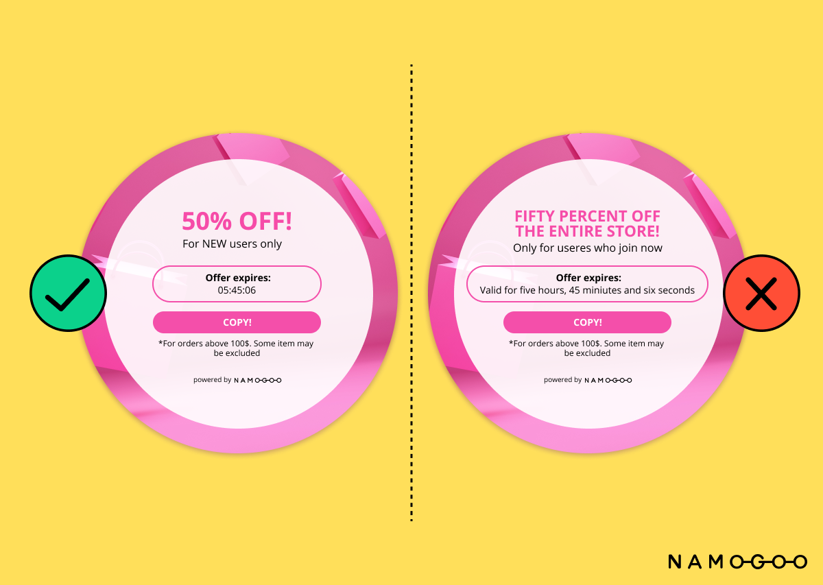
Last but not the least, there’s the messaging. Your promotions should include easily digestible copy that is concise and incisive. When writing copy, only include the core content needed to convey your message; get straight to the point and opt for colloquial word choice rather than complex language. It’s advantageous to shorten the text in eCommerce promotions.
Bonus Tips
Applying these design and copy best practices will help you create a better online experience for your shoppers, but there are more tips to consider in order to create sophisticated promotions that will convert. Make sure you’re factoring these into your planning process before finalizing the design and copy.
Create a Visual Balance of Design and Copy
Text and images should complement each other, not compete with each other. Your promotion material should be easy to visually scan, and its message should be able to be deciphered in only a few seconds before the shopper moves along. One common tactic is to keep the copy short, while letting the image tell the story.
Showcase Your Product in the Graphics
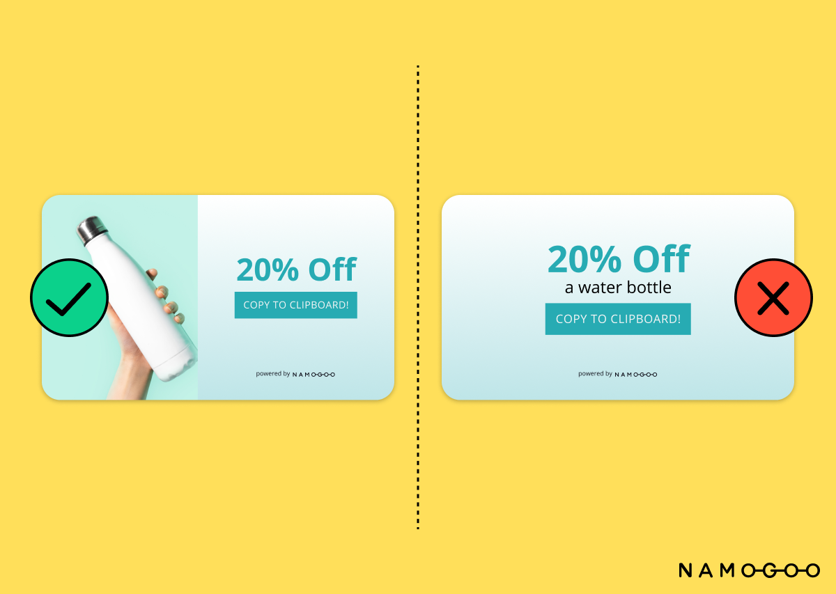
The best way to communicate your message in a promotion is by showcasing what matters most – the product itself. Shoppers want to know exactly what they’re buying before they spend the money, so they need a visual aid for the product in the promotion itself. For instance, if you’re selling a water bottle, consider adding a graphic of the water bottle in the promotion. Successful promotions will leave shoppers feeling confident in their product choice before they purchase.
Use Holiday and Seasonal Colors
Holidays are a great excuse to offer promotions to reward loyal customers and to incentivize new ones to purchase. For eCommerce brands, shoppers expect online promotions and discounts during each holiday, so be strategic and mindful of color choices for holiday and seasonal promotions. For Christmas, green and red are classic, festive colors. Orange and black are associated with the autumn season and Halloween. For Valentine’s Day, pink and red are popular colors. Use pastels for spring and darker hues for winter.
Great Design and Copy is Just the First Step
When creating promotions, it’s important to be intentional in all decisions, from color choice, to font choice, to image choice. Marketing managers, graphic designers, and copywriters play key roles in the eCommerce space, where they’re expected to create positive user experiences through good promotional design. Besides designing meaningful user experiences, brands also need to A/B test their promotional designs to find the best performing results. Making the right design and copy choices for promotions and testing them is key, as strong promotions can boost engagement and drive conversion rates.


